AQ PulseGrid: live Spark + Fabric urban intelligence across 71 metros.
Public feeds, Delta lakehouse patterns, ML stress scoring, and an embedded Power BI report — plus how Aurea Quantra builds the same discipline for ERP/CRM operational BI.

We build operational BI systems that help leadership trust the numbers, understand the business, and act faster.
Real-world BI for companies where ERP, CRM, finance, and operations all need to tell the same story.
AQ PulseGrid (below) is the flagship public demo: worldwide metros, transit/weather/airport signals, and Fabric embed at pulse.aureaquantra.com. Further down, a manufacturer/distributor narrative illustrates how we shape ERP, CRM, backlog, and margin stories for mid-market clients — all synthetic, no client data.
View live demoAsk CopilotUnder the hoodBook a BI review
On this page: Live experience · What it shows · Business questions · Model discipline · Visual walkthrough · Next steps
Interactive experience
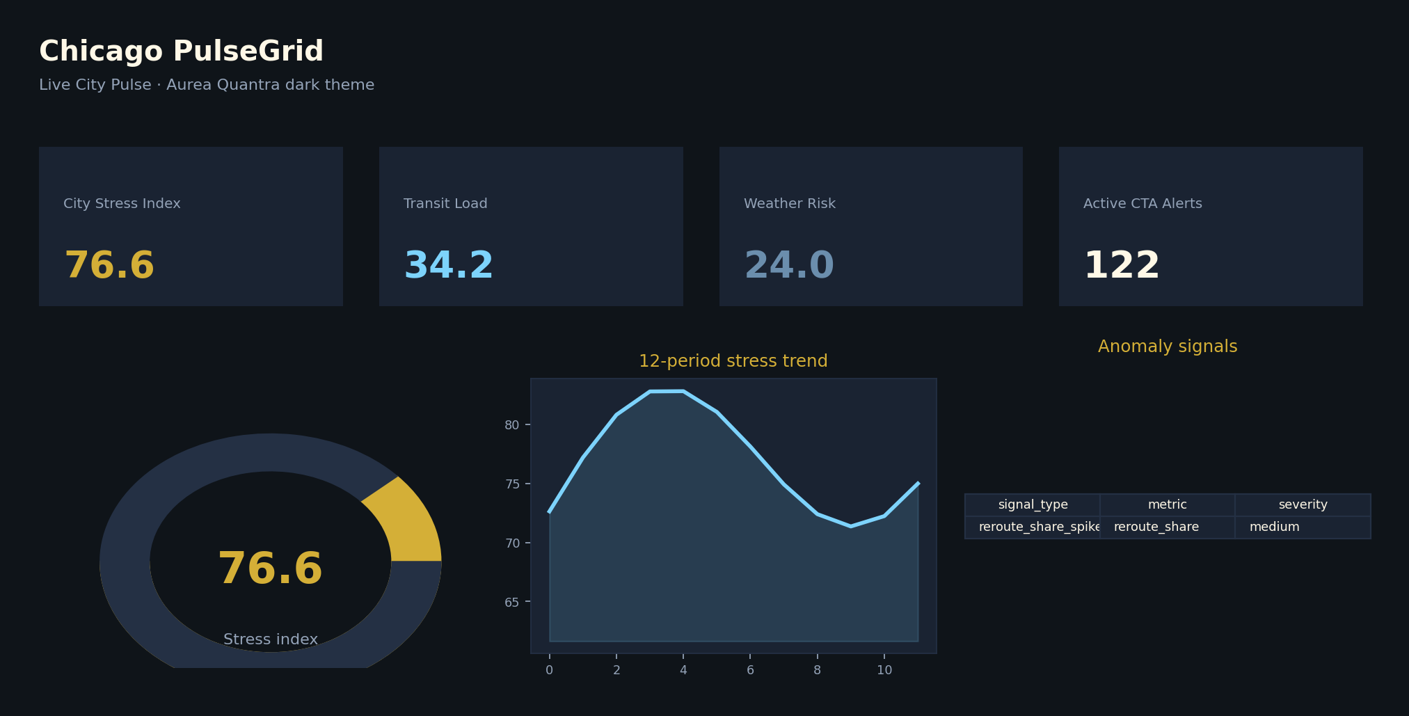
Metro slicers, City Pulse KPIs, and the embedded Fabric report below. Try Ask Copilot for natural-language Q&A on Chicago metro signals. No sign-in required.
Loading…
Data from pulse.aureaquantra.com · OpenAPI · /api/pulse
What the demo shows
AQ PulseGrid (71 metros)
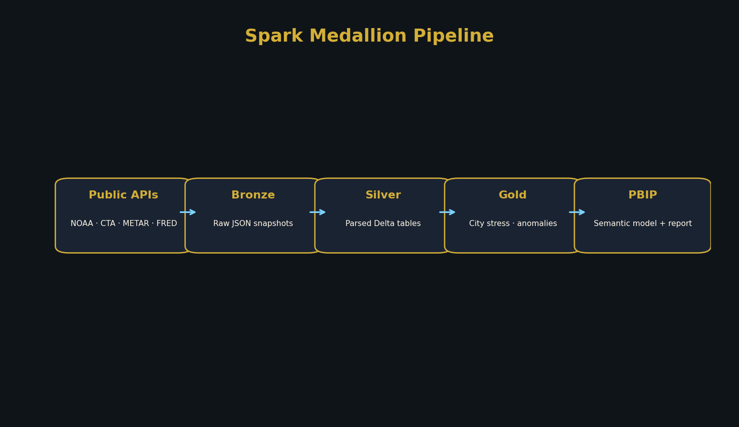
Spark/Delta pipeline, public API feeds, ML City Pulse Score, geospatial hex grid, automated PBIP generation, and live Fabric embed.
Operational BI patterns (ERP/CRM)
How Aurea Quantra unifies sales, finance, CRM, ERP, samples, backlog, and margin for mid-market teams.
Executive overview
Leadership can see revenue, margin, backlog, and forecast variance in one screen without chasing multiple reports.
Margin intelligence
Identify which products, customers, or regions are growing revenue while quietly eroding profitability.
CRM + ERP reconciliation
Compare pipeline activity against actual orders, invoices, and fulfillment data.
Sample-to-order conversion
Track whether sampling activity is converting into real revenue by collection, customer, rep, or region.
Operational backlog
Give sales, finance, and operations a shared view of open demand, fulfillment pressure, and aging orders.
Business questions this walkthrough stress-tests
Each topic above lines up with views in the live experience, so you can explore the same questions executives tend to ask in working sessions.
- Which customers and channels are driving profitable growth?
- Where is backlog building and where is fulfillment pressure rising?
- Which samples convert to revenue — and how quickly?
- How cleanly does CRM pipeline activity line up with ERP orders, invoices, and fulfillment?
- Are margin trends improving or eroding by product, customer, or region?
- Would these KPI definitions hold up in finance review?
Under the hood
The demo is designed to show more than dashboard visuals. It reflects the structure behind durable BI systems: clean modeling, reusable measures, security-aware reporting, and business logic that can survive real executive questions.
Want this level of clarity on your own ERP and CRM sources?
Example use case
Midwest manufacturer / distributor
Before
- Weekly reporting depended on Excel exports
- Sales and finance used different revenue numbers
- CRM pipeline did not reconcile cleanly to ERP orders
- Margin reporting lagged behind business decisions
- Leadership had limited visibility into backlog and fulfillment risk
After
- Unified Power BI semantic model
- Standardized KPI definitions
- Executive dashboard for revenue, margin, backlog, and pipeline
- Operational drill-through views for teams
- Reduced manual reporting prep and improved trust in the numbers
Example use case is fictionalized and based on common mid-market operational BI patterns.
Visual walkthrough
Screenshots from the open-source AQ PulseGrid project (Chicago / platform PBIP). View repo.
Live City Pulse (Chicago)
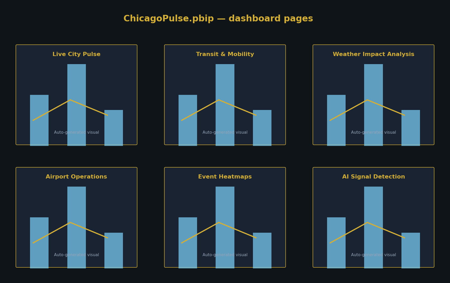
Dashboard gallery (nine PBIP pages)
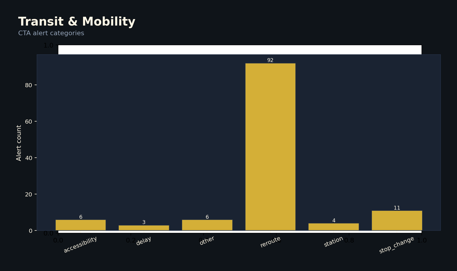
Transit & mobility
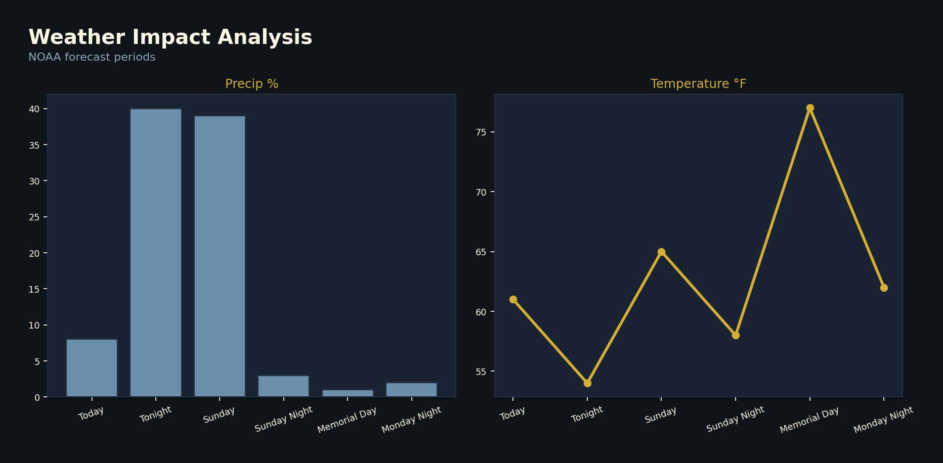
Weather impact
Spark pipeline (bronze → gold → PBIP)
Want a BI system like this?
Aurea Quantra helps mid-market companies turn scattered operational data into trusted Power BI reporting. If your team is still reconciling ERP, CRM, finance, and sales data manually, this demo shows the kind of system we can help build. For delivery scope and typical engagements, start with the services overview.
Schedule a BI reviewContact Aurea Quantra
Synthetic data only: Invented companies and illustrative facts — suitable for public walkthroughs. Request a dashboard review when you are ready to talk about your own sources.